The quiet power of a single accent colour
When everything is emphasised, nothing is. A case for designing with exactly one accent colour and letting restraint do the talking.
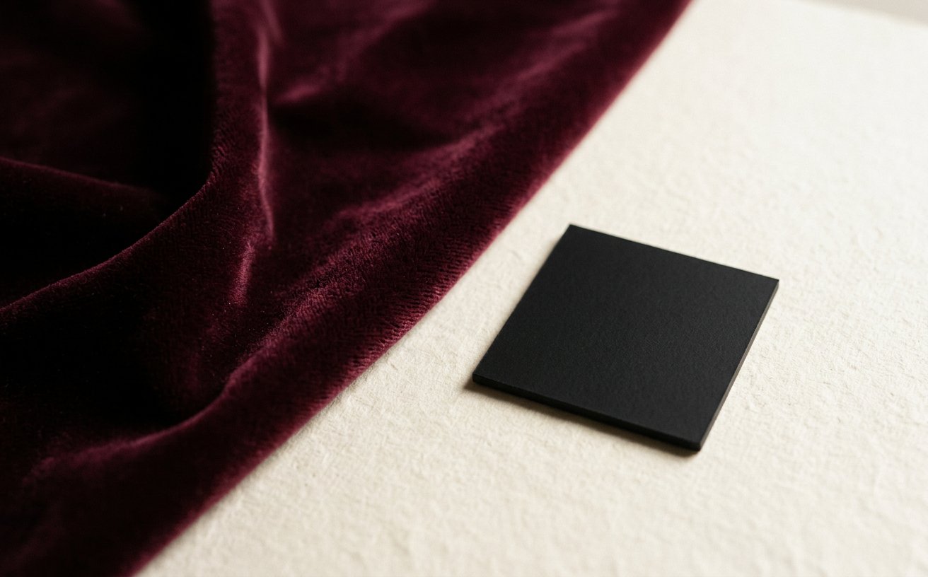
Start with the constraint
When everything is emphasised, nothing is. A case for designing with exactly one accent colour and letting restraint do the talking. Everything else in this article follows from that one decision, and the constraint is almost never aesthetic.
What I do differently now
Three years ago I would have opened Figma first. Today I open a blank text file and write the page in sentences — headline, subhead, the one thing the visitor should do. If the copy cannot carry the page, no amount of illustration will.
A short checklist
- Does the first screen answer what is this and what do I do next?
- Is there exactly one accent colour doing the pointing?
- Can the layout survive a 30% longer headline?
- Does it still work at 320px wide with the images turned off?
The part nobody posts about
Most of the value lands in the boring middle: naming layers, writing usage notes, and deleting the two ideas that were competing with the good one. Craft is mostly subtraction.
If you take one thing from this: shorten the page, strengthen the type, and let the accent colour earn its place.

Mariana Nightflower
UI/UX & Web Designer. Writing about design process, craft and the business of a small studio.
About the studioKeep reading

Dark interfaces without the mud
Warm darks, contrast ratios, and why pure black is usually a mistake.